Watching the Oceans Warm: A New Tool for Visualizing Climate Change
Climate change is the existential risk of our time. Without immediate, systemic action, life on earth will get significantly worse for billions of people in the next 100 years and beyond. Increased CO₂ being pumped into the atmosphere has effects all over the globe. Much of the excess heat entering the earth since the dawn of the industrial age has gone into the oceans; they are now reaching the limits of their ability to absorb heat and CO₂. They’re not just warming—they’re approaching tipping points that will fundamentally alter ocean currents, devastate coral reefs, supercharge hurricanes and typhoons and lead to runaway polar melting.
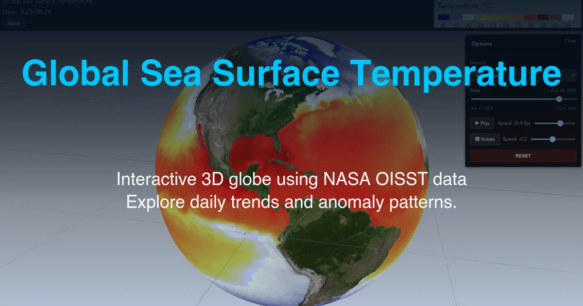
I’ve been watching sea surface temperatures for some time, using an open-source tool I created, originally to check the results of a Climate Reanalyzer visualization but which has since taken on a life of its own. My tool is updated daily and produces maps and graphs of historical sea surface temperatures. It is an amazing testament to the incredible work of scientists and engineers worldwide that we have access to real-time data like this. What I was always missing, though, was a beautiful, interactive 3d globe with the sea surface temps visualized directly, in a compelling, accessible way. That’s why I built Globe Viz.
Globe Viz: Making Ocean Temperature Data Visible
Globe Viz is an interactive 3D visualization of daily global sea surface temperatures, powered by the same NASA OISST (Optimally Interpolated Sea Surface Temperature) dataset used in my Sea Surface Temp graphs. You can spin the globe, zoom into any region, scroll back and forth in time, and watch how ocean temperatures change with data-based animations. It shows both absolute temperatures and temperature anomalies—the deviations from long-term averages that reveal the warming trend with stark clarity. I also find it oddly beautiful to watch the ocean currents flow (hit Play and rotate to your favorite vantage point).
Who It’s For
This tool is for anyone who wants to understand climate change through data rather than rhetoric. It’s for:
- Students and educators who need to see the patterns—El Niños forming and dissipating in the tropical Pacific, the seasonal cycles, the long-term warming trends
- Journalists and communicators who want to ground their climate reporting in real, current data
- Climate researchers who need quick, interactive access to global temperature data
- Concerned citizens (all of us, really) who want to see what’s actually happening to our planet right now, not in some abstract future
You don’t need a science degree to use it. You just need curiosity and a willingness to look.
Why This Matters
The evidence the visualization shows is stark. For instance, in the anomaly view, the color scale extends more than twice as far on the warm side as it does on the cold side. That’s not a design choice; it’s a reflection of reality. Due to global warming, the warmest sea surface temperature anomalies (departures from historical average) are now well over double the coldest ones. The planet isn’t just warming; it’s warming asymmetrically, dramatically, measurably.
When you zoom into the Caribbean during hurricane season, you can see the bath-warm waters that fuel category 5 storms. When you look at the Arctic Ocean, you can watch the ice-cold regions shrinking year after year. When you track the tropical Pacific over months, you can watch El Niño events develop and understand why they trigger droughts, floods, and weather chaos around the world.
This isn’t hypothetical. This is happening now, and we can see it.
Making this data visible and accessible isn’t going to solve climate change by itself. But we can’t address what we can’t see, can’t understand, can’t measure. And right now, too many people are disconnected from the physical reality of what’s happening to our planet’s oceans.
The Technical Details
The app uses NASA’s OISST daily data at 0.25° resolution, which I process through my sea-surface-temp-viz project and host on AWS S3. The 3D globe viewer is built from scratch and handles the daily data tiles efficiently, letting you smoothly navigate through space and time. You can mouse-wheel zoom, pan, and scrub through dates to see patterns emerge.
The tool is all open source under the MIT license. The data generator and the globe viewer are both on GitHub (sea-surface-temp-viz and globe-viz). Fork it, improve it, use it however you want.
Try It
Go to globe-viz.oberbrunner.com and start exploring. Watch how the waters warm through summer, how El Niño shifts the temperature patterns, how the Arctic Ocean changes through the seasons. Hit Play and watch the the westerlies off Africa, warming in the Sea of Japan, and the intense heat waves in the Middle East and the Mediterranean. See for yourself what the data shows. The oceans are warming. The data is clear. Now it’s visible too.